Ask a Lightroom Expert – Wedding Photography Help
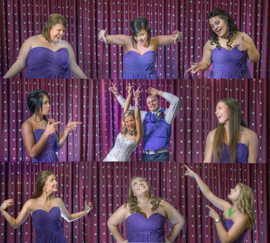
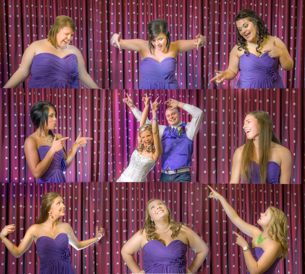
Q: As you may know I did my first wedding for charity last weekend in Memphis. There are some changes that I need to make, however for the most part I am pretty satisfied with the way it came out–especially considering the venue was a hampton inn. Afterwards I prepared my first composed wedding image. As always would love to hear critiques about the work. I am not nearly as good at photshop as I need to be but this was cool to practice. I am sure that a pro with real coloring skills can get this image looking awesome. I attached a high quality JPG so you can take a stab at it. The PSD with all the originals is like 300MB because I combined 9 raw images and layer masked them together.
A: Are you saying you had trouble matching the color from shot to shot? Or just getting the color balance correct in general? If you meant your shots were inconsistent in color that is very easy to correct in lightroom if you are shooting raw. Jpeg is slower and less precise.
For lightroom just set the color temperature the way you like it and then copy and paste those settings to the rest of the images. The copy paste (batch processing) functionality of lightroom is what makes it such a powerful tool for editing large amounts of photos such as wedding shots. When I edit in lightroom I try to get a consistent look for each group of photos where the light was similar. For example all formals should look the same, all dance floor pics, ceremony, etc.
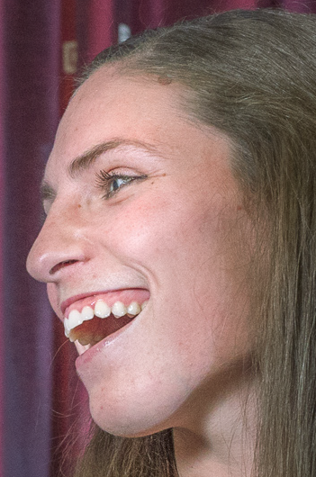
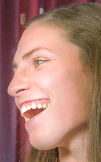
For the image you shared it looks oversharpened and has excess noise, which is doing the bridesmaid’s faces no favors. In the edited (after) image I made some small tweaks to noise reduction and clarity which really cleans up the complexion issues. When dealing with faces, especially women’s faces on high megapixel cameras, this is a good trick to quickly and easily “airbrush” the skin a bit and make it look more like we expect to see. See the before and after example below:
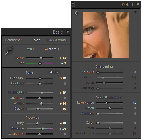
I also made some slight adjustments to the vibrance, color, and brightness to make it pop a bit more. I think fun photos like this should be more colorful, bold, and bright, since that is the mood of the shot. That is what I went for. You might be surprised how much of a difference you get by just adjusting the color temperature. Take a look at my “after” version of the image with just the lightroom settings used that are shown above.

